



SHABTA. Parfums

A fragrance identity carried from the wordmark and colour palette into product and digital applications.

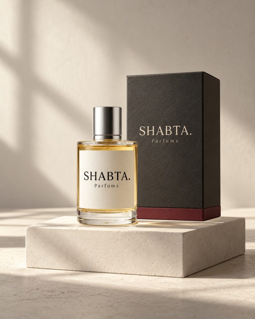
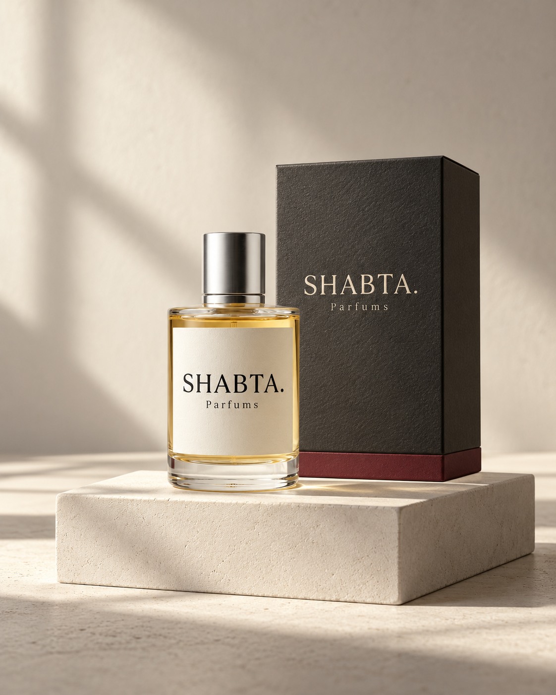
SHABTA. Parfums bottle and charcoal carton in a brand presentation.
Client
SHABTA. Parfums
Services
Brand identity, visual language and digital design

A scent needs a point of view.

SHABTA. Parfums needed an identity that could carry the character of the brand before anyone experienced a fragrance. The identity brings the logo, typography, colour and tone of voice into one system.

A recognisable signature.

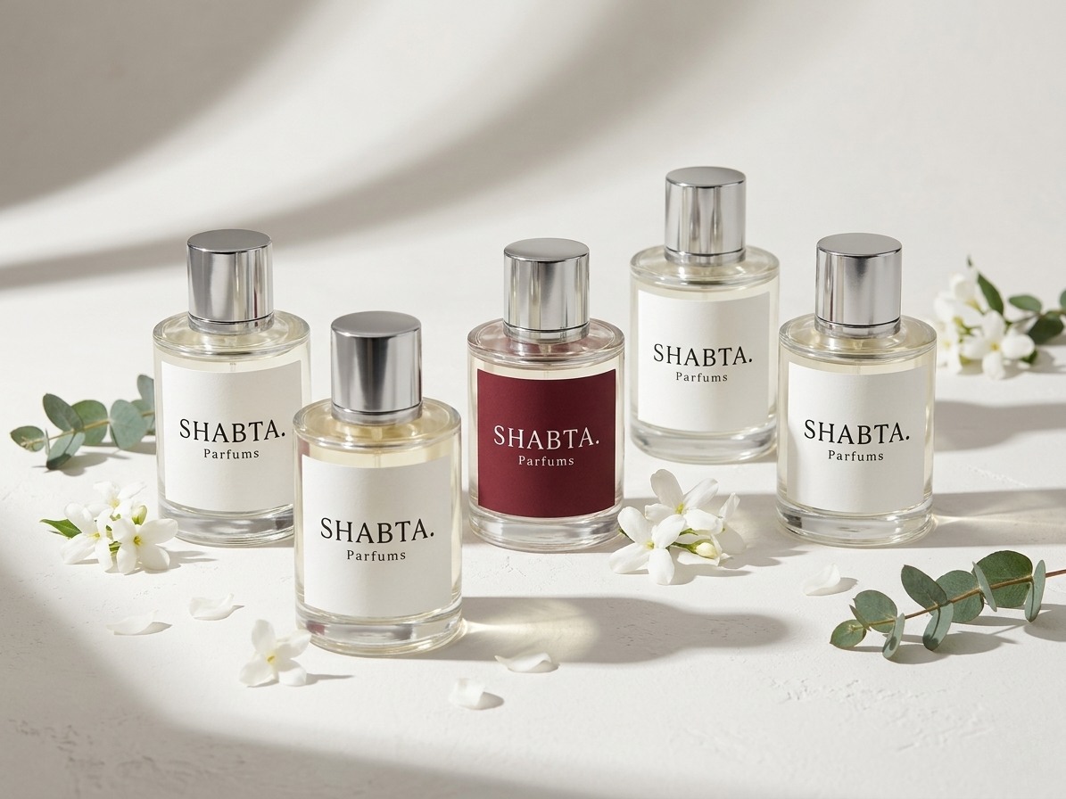
A carefully spaced serif wordmark sits at the centre of the identity. Warm white, charcoal and a restrained burgundy accent give the brand a consistent palette across its applications.
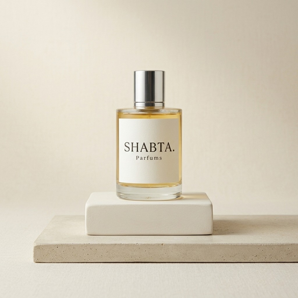
Consistent at every scale.

The brand guidelines set out how the name, mark, colours and type work together, from a small product label to a larger digital composition.
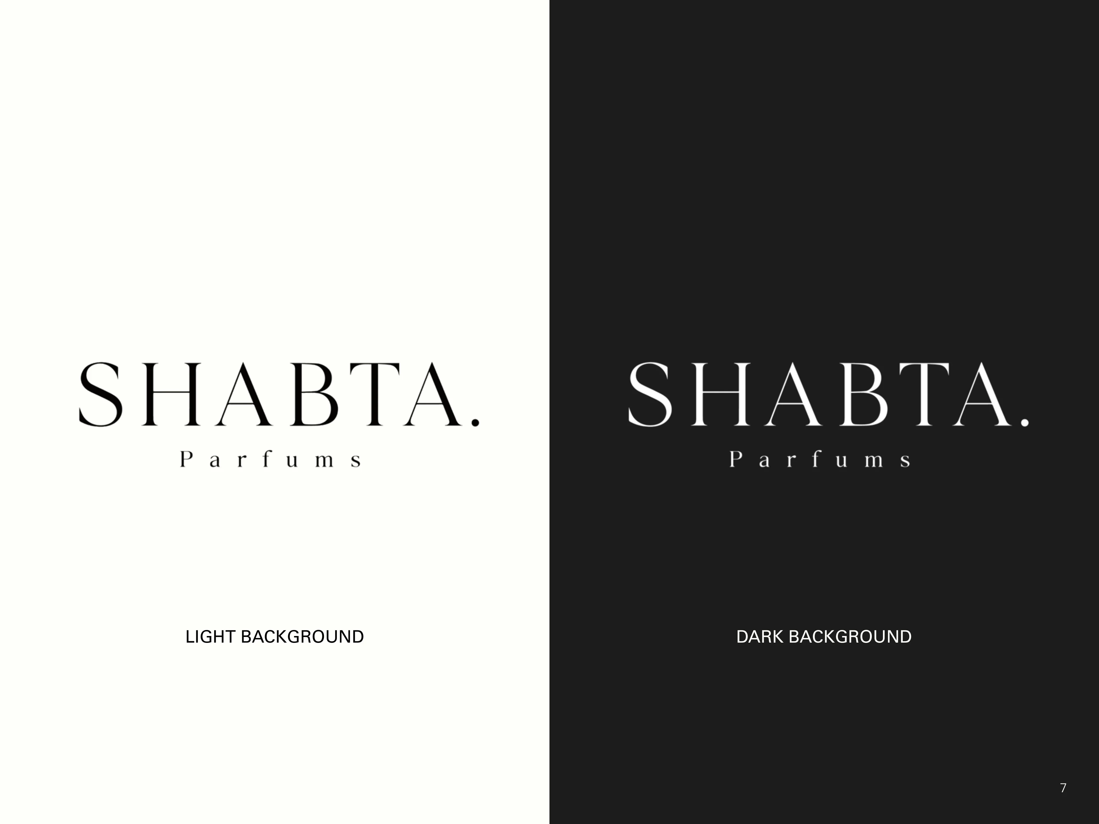
SHABTA. Parfums logo in its light and dark applications.
Light and dark identity applications.