




A fresh point of view.
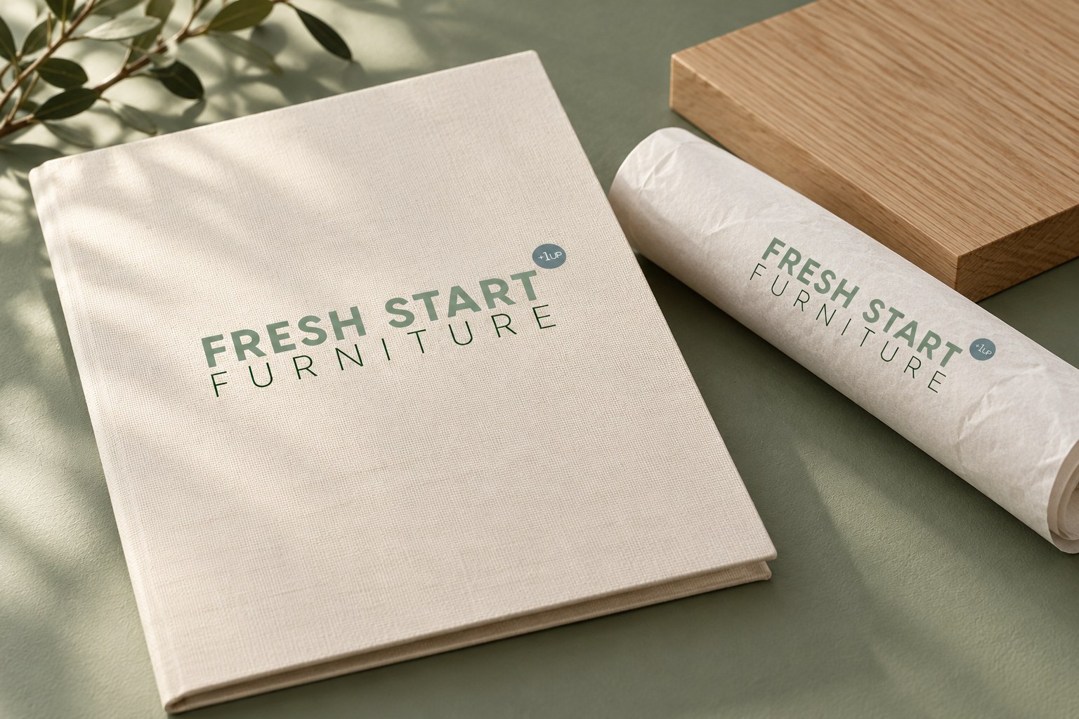
Sage and forest greens sit alongside warm neutrals, drawing the palette back to the materials and textures of a home. The wordmark gives the identity a clear focal point, while generous spacing keeps the composition calm and easy to read.
The colours, lettering and layout principles give the furniture and interior design work a shared character. They leave space for the pieces themselves to lead, whether the identity appears beside a product photograph, within a printed layout or as a simple brand mark.